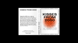


The brand approached us for comprehensive support in order to strengthen its foundations and ensure overall consistency — from strategy to product design, through to visual identity.
Conceived as a structured yet playful brand, the logotype and its symbol deconstruct typography to emphasize the idea of evolution and adaptability. This approach allows for the development of a graphic and geometric visual language that fosters attachment and engagement among children, much like a mascot would. These shapes are sometimes personified, expressing the different emotions children experience and encouraging self-expression.
The five signature colors reflect the brand’s vibrant and gender-neutral universe, with Forest Green as the dominant shade, balancing the other bright and energizing tones. This palette defines not only the graphic world of the brand but also its evolving size guide, ranging from 0 to 6 years.
©2026 Marie Tixador. Tous droits réservés.